Cover image featured in Inorganic Chemistry
Mar 20, 2023
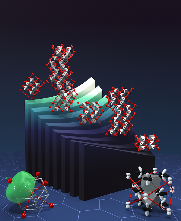
The cover image I made for my 1st first-author manuscript was featured in Inorganic Chemistry!
You need to be committed to make a nice, 3-D cover.
It took me an entire week to make the cover. I didn't work on manuscript revisions, I didn't work on other research, I concentrated solely on the figure-making process. Was it worth it? For me, yes, but I rather like making figures (despite the constant complaining). I can't imagine what a headache this would be for someone with less interest in learning new image-making software.
If you thought doing revisions for paper figures was tough, try doing revisions for 3-D figures. I think I was lucky this time, as the final product didn't deviate much from the concept sketch. However, changing colors, textures, and lighting became increasingly difficult, as my aging 8 year old laptop began to struggle with rendering. Blender did crash multiple times. Go find a desktop computer with a dedicated graphics card.
Workflow
Conception
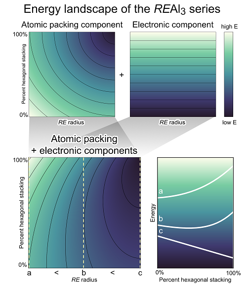
I based the concept after the energy surface in the conclusions section of my paper.
 Energy landscape of the REAl3 series
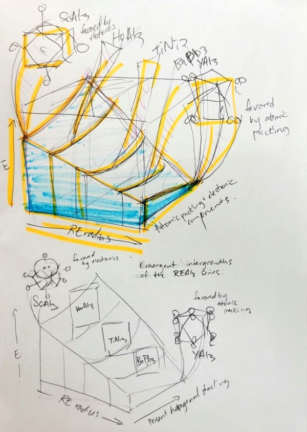
 Concept Sketch
Thumbnailing (a skill I picked up from my hobby of drawing comics during high school and undergrad) is a useful skill that everyone should pick up. It doesn't require art skill. If you can draw boxes and circles, you can thumbnail. As we're working on a scientific figure (as opposed to storyboards or comic pages), we have the leeway to use annotations to make up for any lack of drawing skill. Drafting a smaller, simplified version of your idea can help you eliminate what doesn't work and refine what does.
You can see above that my first thumbnail (highlighted in blue and orange) is quite messy, but it helped me find a better angle for the surface in my second thumbnail.
Rendering with Blender
To make the 3-D figure, I wanted to use Blender for its exceptional ability to add textures and render lighting. Some of crystal structures (and the foreground CP scheme and DFT-raMO lobes) were generated in MATLAB using our group's figure making utility. To import the 3-D MATLAB objects into Blender, I had to modify stlwrite and write a wrapper script to export individual surfaces in one .stl file. Other crystals were imported from CIFs using a tutorial by CGFigures, whose channel gave me some inspiration.
The energy surface was generated using Blender XYZ surface function. Unfortunately, after typing in the function for the surface, Blender transforms the surface into a static object, so I had to get the surface right before I could cut the surface into slices.
Blender has a steep learning curve, so it took me a whole week wrestling with the program. For almost every task, like how to resize, or fuse and cut solids, or modify textures took a lot of googling and trial and error...
Post-processing with Photoshop
 Before Photoshop
Lastly, after getting the figure as I (and my advisor) liked, I rasterized and imported the .png file into Photoshop, where I added text, the starry background (thank you, color range selector and layer masks!), and made a mockup with placement of the journal's title. This part was much quicker for me, as I'm relatively proficient with Photoshop.
Concluding thoughts
I learned a lot through making this cover, and I have a renewed appreciation for 3-D artists and animators. They should certainly get paid more, because this was no simple task, and I'm working with relatively simple geometrical shapes, versus rigged models! Would I do it again? Certainly! Though I think with the amount of effort it takes, I can't imagine doing it for every paper. The next cover with 3-D graphics should be for a manuscript with maxmimum impact!